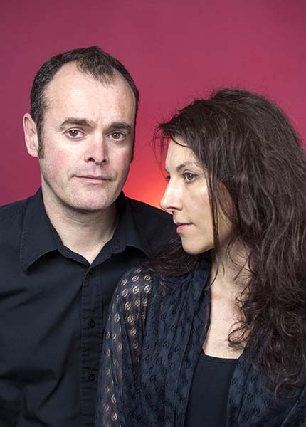
Metaphrog are Franco-Scottish duo Sandra Marrs and John Chalmers, winners of The Sunday Herald Scottish Culture Awards 2016 Best Visual Artist. Today they journey into The Reading Realm to talk about comics, their top tips for using graphic novels in the class and the dark side of fairy tales…
I wonder if we could start by you telling us a bit about Metaphrog, who you are and how it all started for you?
Sandra: Metaphrog is the pen name we use. I’m Sandra Marrs and he’s John Chalmers. We work together making graphic novels and comics and have been doing that since we met in 1994. John writes, I do the art, and we both develop the stories together.
John: When we got to know each other we realised we shared a love of art and literature. I wanted to write and Sandra was drawing and painting. We both love music – that was the main thing we had in common and we also realised we got on well and wanted to work together. We combined our interests creating comics.
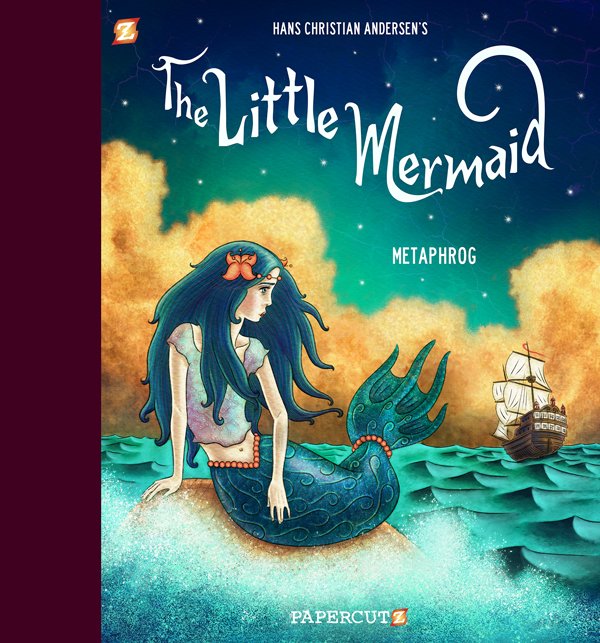
Your newest graphic novel, which is a re-telling of The Little Mermaid, is really beautiful! What drew you to this fairy tale?
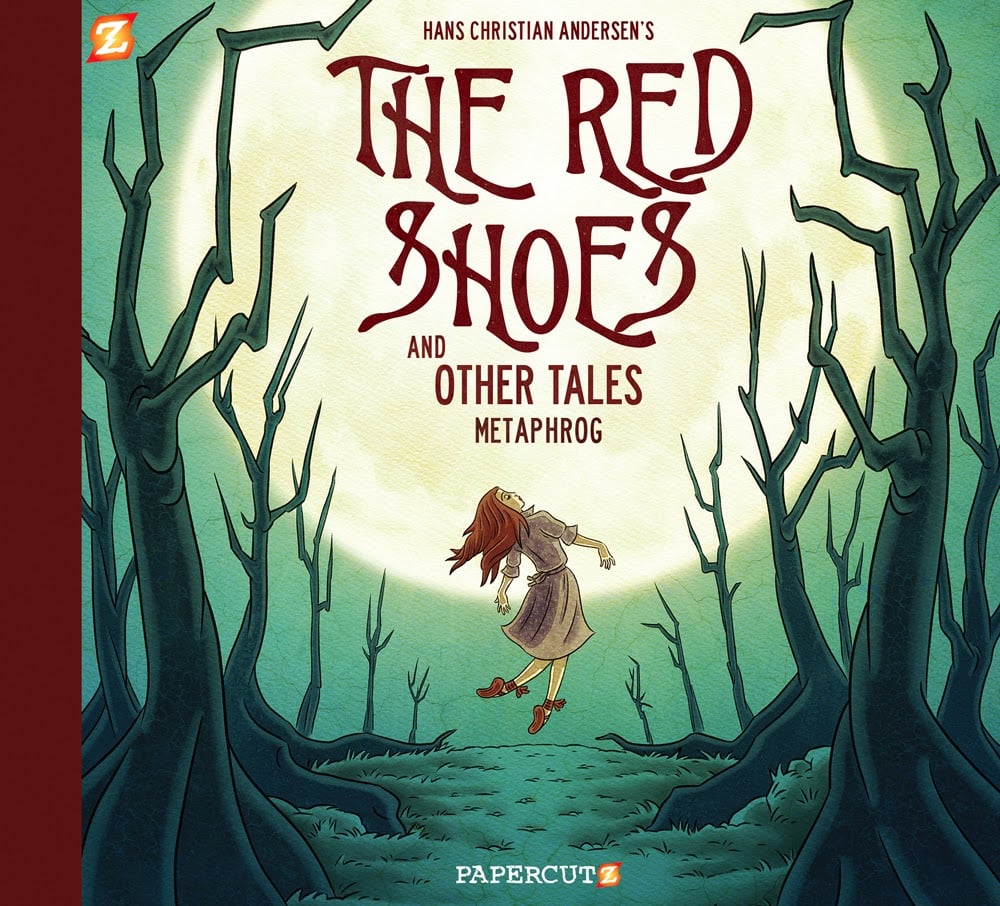
Sandra: As a child I had an illustrated book/record of The Little Mermaid. I loved it and it stayed with me ever since. When our publisher asked us if we would consider making another graphic novel fairy tale adaptation, after The Red Shoes and Other Tales, that’s the story we immediately thought about.
John: Both of us loved fairy tales growing up. Those were some of the best stories. They’re full of magic and also they require a suspension of disbelieve. As Lotte Reiniger said: “I believe in the truth of fairy-tales more than I believe in the truth in the newspaper.” That seems truer now than ever before.
How is your version of The Little Mermaid similar to your other graphic novel, The Red Shoes and Other Tales? How is it different?
Sandra: Well, both books contain our vision of a tale: modernised, personalised and turned into comics. The Red Shoes and Other Tales book also includes The Little Match Girl which is another story originally by Hans Christian Andersen. So there are naturally similarities and additionally, physically the books look similar as objects with the beautiful cloth binding. The Little Mermaid adaptation is close to the original tale but we have made it more secular without losing the feeling of spirituality. The key themes of unrequited love, the grass being greener on the other side, and being careful what you wish for, are all there beneath the brightly coloured surface.
John: Sandra poured her heart into The Little Mermaid, but The Red Shoes also spoke to her very closely as it is about obsession. As artists it is important to remember to play – and not to work all the time – and keep a work/life balance! Both are quite dark tales. Even The Glass Case which is a tale of our own invention is pretty bleak. The art in The Little Mermaid is much more centred on colour.
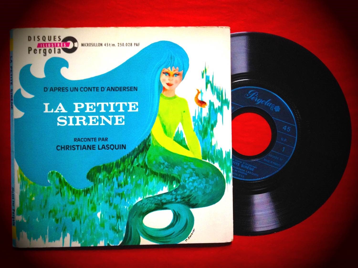
I was OBSESSED with The Little Mermaid as a child and remember my Nan and Grandad asking a local artist to sketch a mermaid fountain for me in a town they were visiting one holiday. Do you have a favourite piece of mermaid art? What’s your favourite artistic depiction of a mermaid and why?
Sandra: I still love the mermaid from the book I had as a child (pictured here) created by M. Kerever. There’s sadly not much information about them available. We both love Edmund Dulac’s art.
What do you think re-telling The Little Mermaid as a graphic novel adds to this already well-known story?
Sandra: There hasn’t really been a graphic novel adaptation of this tale as far as we know. And hopefully we bring something of ourselves to it and transmit our love of the story. We also were keen to retain the sadness and drama of the original because that had been eroded in modern retellings.
John: Sandra’s art creates a richly-textured world that, we hope, encourages a slow reading, an immersive experience.
We are interested in slow time – spending time in a book, the opposite of the faster-paced electronic culture we are surrounded by.
There are some stunning moments in your version of the story where you play around with light and shadow. How important is this to the atmosphere and feel of the story? I’m thinking particularly of when the mermaid visits the ocean’s surface for the first time and everything changes into a stunning palette of oranges and reds and the use of shadow as she peers into the ship.
Sandra: I used the colour palette to enhance the differences between the two worlds: underwater and on land. The story is a dramatic story and so light and shadow enhance that. But creating artwork is quite instinctive and develops naturally. You get a feel for the story and that comes out in the art.
A lot of your illustrations are very intricate. How long does each panel take to plan and design?
Sandra: The planning takes place over several months but I don’t stop thinking or planning when I start drawing. For this book I worked at the rate of two to three pages per week. Some pages took more or less time than others.
I was interested in this illustration – why did you decide to use a circular frame to set and surround the illustration when a lot of the other illustrations are framed by rectangular boxes?

Sandra: It seemed the most appropriate form. The circular panel shape echoes the round portholes and suggests a telescope, an observation from a distance. It fitted well with the rhythmic reading of the page too and marks a shift in the story, when the drama really starts to heighten.
There have been a lot of re-tellings of The Little Mermaid – why did you decide to keep with the traditional storyline?
John: We loved the story and although we wanted to make it a comic version we also tried to stay faithful to the original’s ideas and main themes. Other adaptions are fun too but the power of fairy tales is to be found in their darkness in the harsh truths they expose.
Sandra: We love the darkness and sadness at the heart of the tale.
What advice would you give to young illustrators?
Sandra: Work hard, draw every day!
John: Draw from life and draw what you love drawing but also draw things you don’t like drawing. Reading, looking at nature, going to see art are also important.
How can teachers use comic books and graphic novels in their classrooms successfully? Have you got three top tips you can share with us?
John & Sandra: Three top tips:
- Use graphic novel adaptations as a gateway to the original text but also in their own right.
- Talk about why a comic works well – it’s great for critical thinking and confidence building.
- Let the children make their own comics! They love it, it stimulates their imaginations and their creative writing. And for those who have problems with writing, it really helps them improve.
What illustrators and comic-book artists inspire you?
Sandra: Too many! Illustrators like Erté, Antonio Lopez, comic book artists like Hugo Pratt, Jacques Tardi, Daniel Clowes, Chris Ware and Hergé. Figurative painters: old masters and modern art of the late 19th century and early 20th century…
John: The same as Sandra really, too many to mention but they would include William Blake, John Tenniel, Richard Scarry and Ronald Searle. Steve Ditko, Jack Kirby, Bernie Kriegstein, Art Spiegelman and Bill Griffiths in comics.
Finally, can you tell us what you’re working on next?
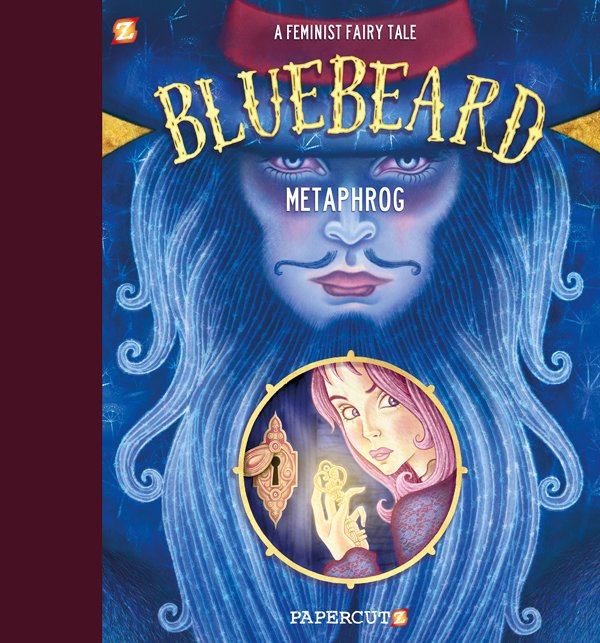
We’ve just finished a third fairy tale adaptation: a completely new retelling of Bluebeard as a feminist fairy tale. It’s a longer story than the previous two, and will be published in May 2020 by Papercutz in the same format. We can’t wait!