Today we have a very special blog post for you, written by Darren Simpson, all about the work that goes into creating a beautiful front cover design!

When I think about the long, elaborate process of creating a book – from finding that seed of inspiration to seeing your story hit the shelves – one of the most intense, exciting and terrifying elements has to be cover art.
It’s just so important, so pivotal. Anyone who says they don’t judge a book by its cover is lying. We shouldn’t judge by covers, of course, but we do.
That’s why one of the biggest fears of any author is a bad book cover. This isn’t just because we worry it’ll put off buyers. More than that, the last thing an author wants is a book cover that feels wrong – an outside that doesn’t feel true to what’s inside. I imagine there’s nothing more disheartening than seeing your story – a story you’ve spent a big lump of your life nurturing, tending to and writing – wrapped in something that doesn’t fit, and presented to the world in a way that doesn’t do it justice.
I say I imagine because I’ve been blessed on this front. The covers for Scavengers and The Memory Thieves were both designed by Will Steele – Fiction Design Manager at Usborne Publishing – and illustrated respectively by Tom Clohosy Cole and Matt Saunders. And I love both covers deeply. Tom’s is striking, rich and nuanced, while Matt’s is so full of atmosphere that it practically glows. I’m very grateful to both artists.


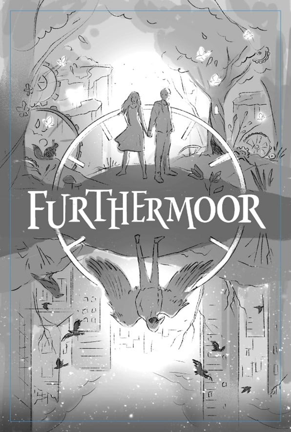
Now, every time I’ve received an email from my editor headed “Early draft cover”, I’ve had a little panic, for all the reasons I mentioned above. I still remember receiving that email while editing Furthermoor, then seeing this initial rough design by Will:

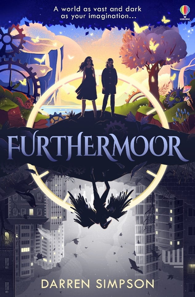
The moment I saw Will’s design, I breathed a sigh of relief. With its central clockface and clever symmetry, I knew Usborne were onto something special. And then Anna Kuptsova stepped in, bringing the design to life with her incredible detail, colouring and shade.
Feast your eyes:

I’ll admit, I can be a bit picky. And thankfully, Usborne are always very gracious when I suggest tweaks for their covers-in-progress. But Anna’s illustration left me stunned; I couldn’t find a single thing I’d change. The three characters’ poses say so much – and so economically – about their personalities, and I’ve never seen a cover that so boldly divides its colours. The contrast between the top and bottom halves perfectly captures the contrast between the novel’s two settings – an urban estate and a jewelled mechanical forest – while the watch that’s so integral to the story cleverly binds both halves together.
Gorgeous, isn’t it?
I’ll spare you more gushing, and hope you like Furthermoor’s cover as much as I do. I’d like to thank Will and Anna again for creating such a bold, beautiful and inventive image that’s not only pleasing to the eye, but also provides an outside that’s true to what’s in.
We are really lucky now to have an exclusive extract from Chapter 3 of Furthermoor!
Chapter Three – The Tunnel Tree
Bren hunched up his shoulders, skulking along the fence that separated the playground from the main road. The cold air was alive with noise: calls from the students playing football, the scuff and clop of school shoes against concrete, catcalls and laughter, natter and babble.
He had his hands in his duffel coat and could see his breath leaving him in clouds. The caretaker had scattered grit and salt on the playground that morning, but a thick frost still lingered at its edges.
Bren peered furtively at the football match while he passed. The ball was followed by whoops and cries as it shot between two backpack goalposts. When the scoring champion ran a lap round the makeshift pitch, Bren tried to remember how it felt to sprint like that with everyone watching – with your arms in the air and cheers in your ears. It seemed unimaginable now.
Bren stared at his feet and kept walking. He paused before hitting the path from the main building to the arts block, then turned to check the playground in case Shaun, Isaiah or Alex were watching. The last thing Bren wanted was Shaun and his lackeys figuring out where he went every lunch break.
They didn’t seem to be about, so Bren continued on his way, passing the trees that lined the path and pushing through a glass door.
The arts block was always deserted during lunchtime. That was why Bren liked it. He opened his backpack and began wolfing down lunch, all the while hurrying past wall displays plastered with pop art. Then he eased a door open and – after checking no one was around – entered the school’s music room.
The space was shabby and cramped, with metal chairs folded along one wall, and instruments piled in cases along the other. After finishing a banana and shoving its peel into the lunch box in his bag, Bren crossed the room and sat on the carpet in the far corner, safely out of sight behind a battered drum kit.
He’d already pulled the watch from his pocket. He brushed his thumb across its green face, then closed his eyes and held it against his ear, allowing his heartbeat to settle into the clock’s ticking rhythm. His stiff shoulders sank, losing their tautness.
Tick.
Tock.
Tick.
Tock.

