Today we welcome author and illustrator Bethan Woollvin into The Reading Realm to talk about her series of subversive, witty, dark picture books which are based on classic fairy tales…
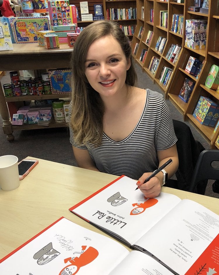
Have you always been fascinated by the magical world of fairy tales? Did you have a favourite as a child?
Though I would certainly consider myself to have a fascination with fairytales now, I don’t think I did as a child. I actually found them for the most part, to be rather dull! I was a confident child, who didn’t make time for stories about passive (female) characters. I loved intense stories with vast worlds and well written characters, but to my annoyance, most of these characters were males.
I was an avid reader, and quickly progressed through picture books into chapter books. It was then that I found a new love for dark, folklore-ish books with the endless ’Goosebumps’ series, and a little later, I discovered Anthony Horowitz too. Books which only encouraged my love for dark stories!
In terms of strong female role models in fairytales, there wasn’t much to go on. The best I could hope for were child eating, hair stealing, evil apple giving witches, and though I adore a female villain, I found myself moving onto other stories entirely. So, I think that my dis-interest in fairytales as a child, actually lead to my interest in changing them as an adult.
Of course, there were elements of fairy tales which I enjoyed, such as the dark twists, and spooky woodland settings. I’d find myself excitedly reading the beginning of a fairytale, only to be very quickly disappointed when the female characters didn’t live up to my expectations. Instead, male latecomers would be introduced, swoop in and save the day. Ugh!
Despite all of this, my favourite fairytale would be Hansel & Gretel, just because it’s so creepy. The setting is delightful: a gingerbread house in the middle of the forest, covered in sweets and delicious treats. Most importantly, I loved that after the evil witch captures the children, they get their revenge by pushing the witch into the oven, a fate she had intended for the children.
How would you describe your style of artwork? Are there any artists and illustrators who have particularly inspired you?
I’d describe my illustrations as simple, bold and painterly. As a creative, I continue to be inspired by other creatives, classic or contemporary. But there are far too many to list! In terms of fine artists, my biggest inspiration, and earliest fondness of a fine artist was Matisse. I adored his line drawings and paintings, and also his cut outs of organic shapes. I use a lot of those very inky, brushed black lines in my artwork, along with Matisse-inspired trees and bushes in my fairytale worlds.
Tove Jansson, the creator behind the Moomins has also been a very strong inspiration for me and my artwork. I read, watched and played with Moomins as a child, and naturally Tove Jansson’s magical world has extended into my fairytales too. Tove’s character, ‘Little My’ for example, an independent, feisty little girl of the forest has strong similarities to my ‘Little Red’. Even to this day, I still get a lot of ideas from the Moomins, and if I’m ever feeling stuck with creative block, I’ll always dig out my old Moomin books for inspiration!
How important is it to you in your work to challenge gender stereotypes in your fairy tales?
I have quite a vivid memory of myself as a child, drawing onto a picture book of Jack and the Beanstalk. I drew long hair and a typically ‘female’ outfit onto Jack, imagining the story with a female protagonist. What could be more exciting than venturing up a beanstalk, into a magical sky kingdom, the home of a giant? Nothing! I wanted so desperately to be able to relate to these stories, and went to the trouble of doodling my own female stand-ins to make it happen. And though there were a few books I could read with empowering female protagonists in, these certainly were not fairytales.
And so, I feel lucky enough to have brought my childhood idea to life in the form of three fairytales. But this time, the females aren’t standing-in for the male characters, they’re independent enough to own the stories wholeheartedly. I could have included burly woodcutters and handsome princes, but I believe their absence speaks volumes.
It’s incredibly important to me to challenge gender stereotypes in my books. I’m often praised for writing to empower girls with my stories, but that’s not my aim. I don’t write for girls, I write for children. Writing just for girls only solves half of the problem. I’m inspired to create strong female characters in my fairytales, because I want to create female characters both boys and girls will want to read about. It shows children that females are worthy of being written about.
I don’t think I really realised the impact my books were having on children until I started doing more author visits to schools. Each time I tell an audience of children that I’ll be reading ‘Rapunzel’ or ‘Little Red’, I always hear grumbles and groans from the boys, and cheers from the girls. But when I finish reading, they’re all cheering. It’s incredible. I usually push this one step further, and ask the children to give me words to describe the female characters in my books. All the children will give me words such as ‘brave’, ‘clever’, and ‘awesome’. This is what inspires me to keep on writing books!
Your artwork is very striking and you tend to use a just one or two bright colours when illustrating your fairy tales. Why is this? What sort of feel are you aiming to achieve?
The restrictive colour palette in my illustration was something that developed over time while I was at university. We often had the opportunity to experiment with printmaking, which due to the processes, meant you only had a limited amount of colours to print your illustrations in. The more I used printmaking as a means to illustrate, the more adjusted I became to illustrating in just two or three colours. Within my fairytale books the use of a spot colour with black and grey meant that I could highlight or draw the readers’ eye to important clues throughout the book. For example, the axe in Little Red.
It was also a conscious decision I made with my publishers, too. We wanted the fairytales to feel like part of a series. So, by having the two constant colours, black and grey, the books felt consistent, even when the brighter colour changed.
I’m interested in the relationship between your writing and your illustrating. Does the writing come first or the illustrations? How does one affect the other? Do you have a preference for one form over another or are the two inextricably linked for you?
I’ve always considered myself an illustrator first, and an author second, and I never try to hide the fact that I find writing very difficult. Within my process, there are three distinct parts of creating a book. Story creation, illustration and writing. Beginning with illustration, I usually draw very rough, thumbnail type doodles, documenting what I’d like to happen on each spread of the book. Alongside this, I usually work on some story creation, which I basically do in bullet-point format. E.g. – ‘Hansel & Gretel eat house’. I then continue working on the illustrations and storyline in tangent until the final artwork has been completed. Lastly, with a lot of help from my editor, we ‘write’ the book together, filling in any gaps in the story that I haven’t conveyed with pictures.
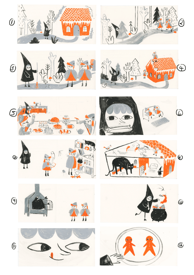
Personally, I love telling stories just with pictures, as it’s the best kind of challenge. If someone can look at my illustrations, and take away the narrative I’ve pictured without needing any words – I’ve done the best possible job I can as an illustrator. However, as a children’s book creator, I’ve become used to working with words, and if they are being used, they need to be used properly!
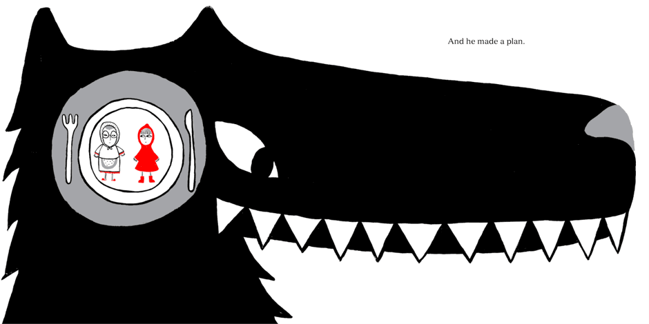
The text and the illustrations need to work together, not just repeating one another in different platforms. For example, with Little Red, I illustrated this spread of the wolf. I could have written ‘And the wolf made a plan to visit Grandma, eat Grandma, then wait for Little Red and eat her too’. But actually, that’s quite long and boring to read. Instead it reads ‘And he made a plan’, and the reader has to put the information together, to make sense of it. It makes the book engaging for the reader.
I love this image from Rapunzel! I especially like the placement of Rapunzel around the pages to show the passing of time. Could you tell us a little bit more about this illustration – your choices in layout, framing, colour and positioning – and what you were trying to achieve?
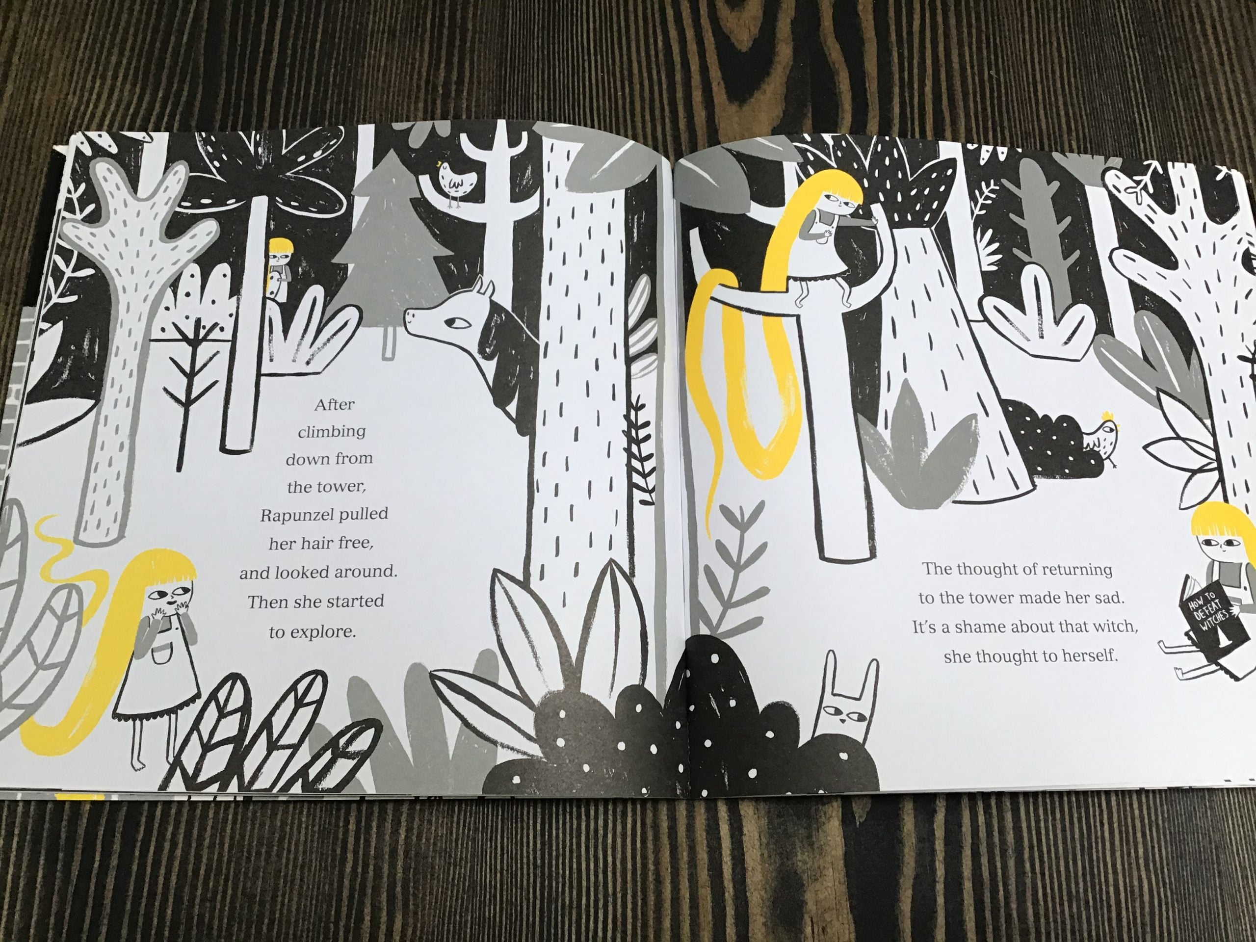
A lot of book illustrating is actually just problem solving, and this one was definitely troublesome to begin with. Generally, most picture books are 32 pages, minus the cover, endpapers and title page, and you’re left with 12 spreads. Telling a story in 12 spreads can be really challenging, and something that I didn’t have space for within these 12 spreads, was pages and pages of Rapunzel having a grand time in the forest. So instead, I had to be creative, and as you say, show the passing of time by illustrating Rapunzel several times over the spread.
Needing enough room for two passages of text, I had to illustrate around these areas. I chose to illustrate the forest in a lot of black, because I wanted it to look a little dangerous and unexplored, a contrast to her familiar tower-bedroom. It was also just an excuse for me to illustrate a huge forest scene, as its one of my favourite things to do!
This illustration from Hansel and Gretel really made me laugh! I love the children’s surly body language! Can you talk a little bit more about how you develop your stories through the characters’ body language and facial expressions?
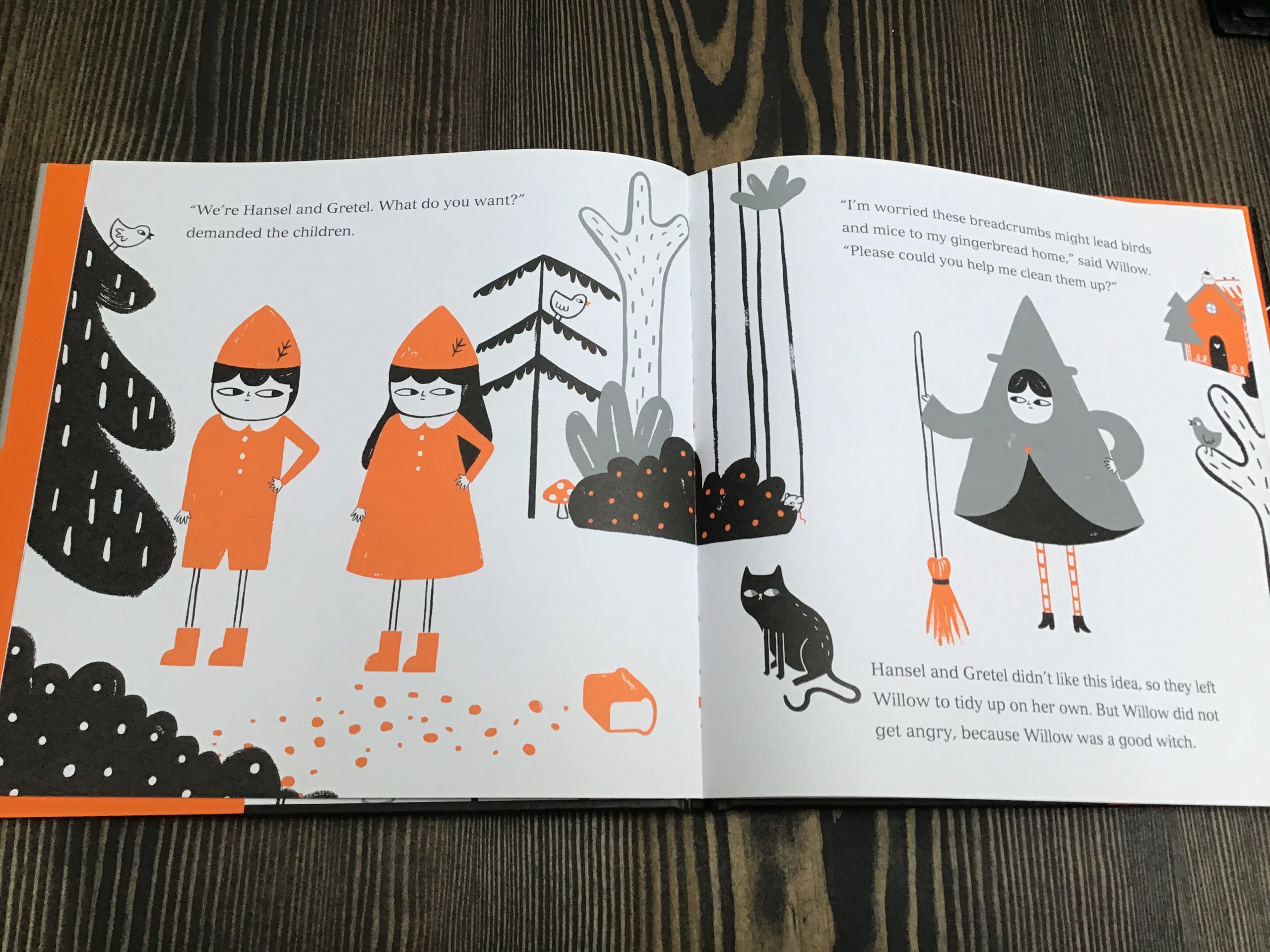
The characters and their personalities are the most important parts of my stories, and often the first thing I’m cultivating when I first start working on a story. From the very beginning, Hansel and Gretel were sassy, ungrateful children. The villains of the story. In this particular spread, I wanted them to look so unbothered that someone, an adult, was talking to them, that they didn’t even turn and face them!
Hansel & Gretel is a particularly interesting story to read to children, as it pushes the moral boundaries. Was Willow really a good witch? Were Hansel & Gretel’s actions excusable because they are children? Did they deserve the witch’s pot?
Naturally, as I create my stories just with pictures to begin with, my facial expressions and characters tend to be far more exaggerated as there isn’t any text to support the story until a lot later in the process. My characters are also usually made up of very basic shapes, (which is purposeful so that children can recreate my characters with ease) and this means the movement and gestures of the characters are more prominent, and as such, sassier too!
Has technology changed the way you illustrate your work? If so, how?
For the most part, I’m still primarily a painter, and like to avoid doing much computer based work. But I have had to adapt to editing software for the benefit of my children’s books. When I finish painting all of my artwork, it’s sent off for scanning and I then edit it in Photoshop. This usually just involves me erasing the white of the paper, so that when it’s printed, it’s on that pure white background. I sometimes do a little retouching here and there, maybe to get rid of a spilled-tea stain or a really badly drawn eye!
What challenges did you face when you first started? How did you stay resilient?
Well, my first book Little Red began it’s road to publication while I was still at university. I had just turned 20. Still a student, I was still studying full time, while also working professionally with a publisher to get my book finished. And this wasn’t just the first publisher I was working with, it was the first professional relationship I had within the creative industry. It was a really big deal to me, and I had no idea what I was doing half of the time! I was learning on the job, and trying to pass off that I knew all of the publishing terminology, while secretly googling it later. Creating Little Red was truly a delight, and the chance to do this, full time – as a job, was too good of an opportunity to let pass by. All I could be was resilient! I worked, and worked and worked. I graduated university with first class honours, and my book Little Red was published a few years later. I still have no idea how I pulled it all off!
What advice would you give to teachers about how to develop reading for pleasure in their classrooms and schools?
My advice would be to give children the freedom to read whatever they like. Adults can easily assume that children wouldn’t like a certain topic, or type of book. Whereas, children are humans with interests too. Some children love reading funny books, and some like scary books, and some prefer non-fiction. We as adults are able to make choices about what we read, and wouldn’t necessarily enjoy a book someone else picked out for us. When doing a reading project, think about whether the project needs to be based upon one book for the entire class, or whether it might be adapted so each child can choose their own book for the project. It would make reading feel less of a chore for the children.
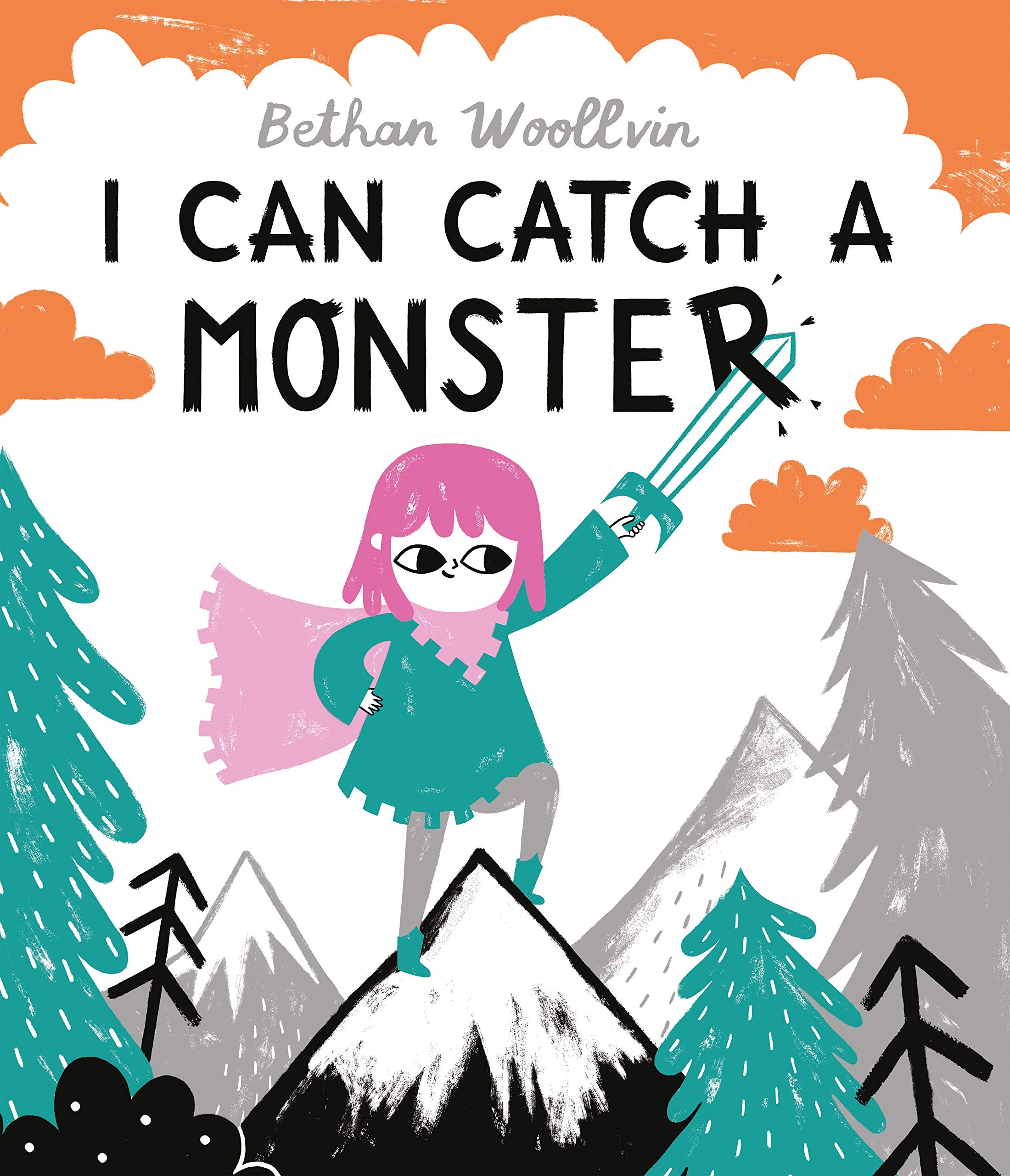
How would you envisage teachers using your book in their classrooms? Do any activities or ideas spring to mind?
When I do author visits to schools, I often do workshops too. One workshop that I’m particularly fond of, is a story creation workshop. I read children my books, and with some writing prompts, ask them to create their own story. But the story is to be told completely in pictures! Excited by the prospect of not having to write anything (like they usually would with their teachers!), the children are often very productive, and create some hilarious stories. When asked to then write some words to go alongside their story, the children can’t stop writing! It encourages children to be really creative, and use a different approach to creating narratives.
What advice would you give to any budding young illustrators?
Don’t get too bogged down in what your creative voice might be. Just keep creating things you enjoy making, and the rest will follow.
Finally, can you describe your books in three words?
Bold, dark and sneaky.
This slideshow requires JavaScript.


One Response
Brilliant article – we’re retelling fairy tales in my creative writing after school club this term and they’ll love this article. Thanks