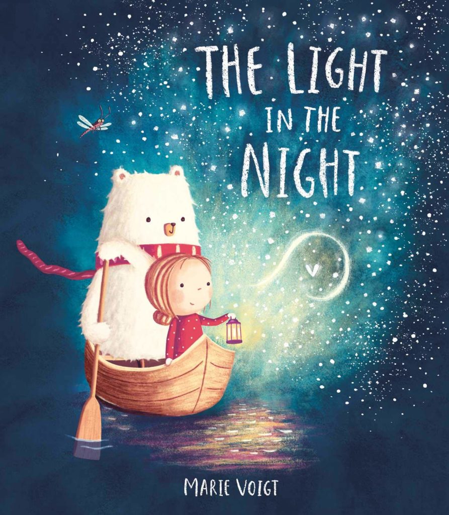
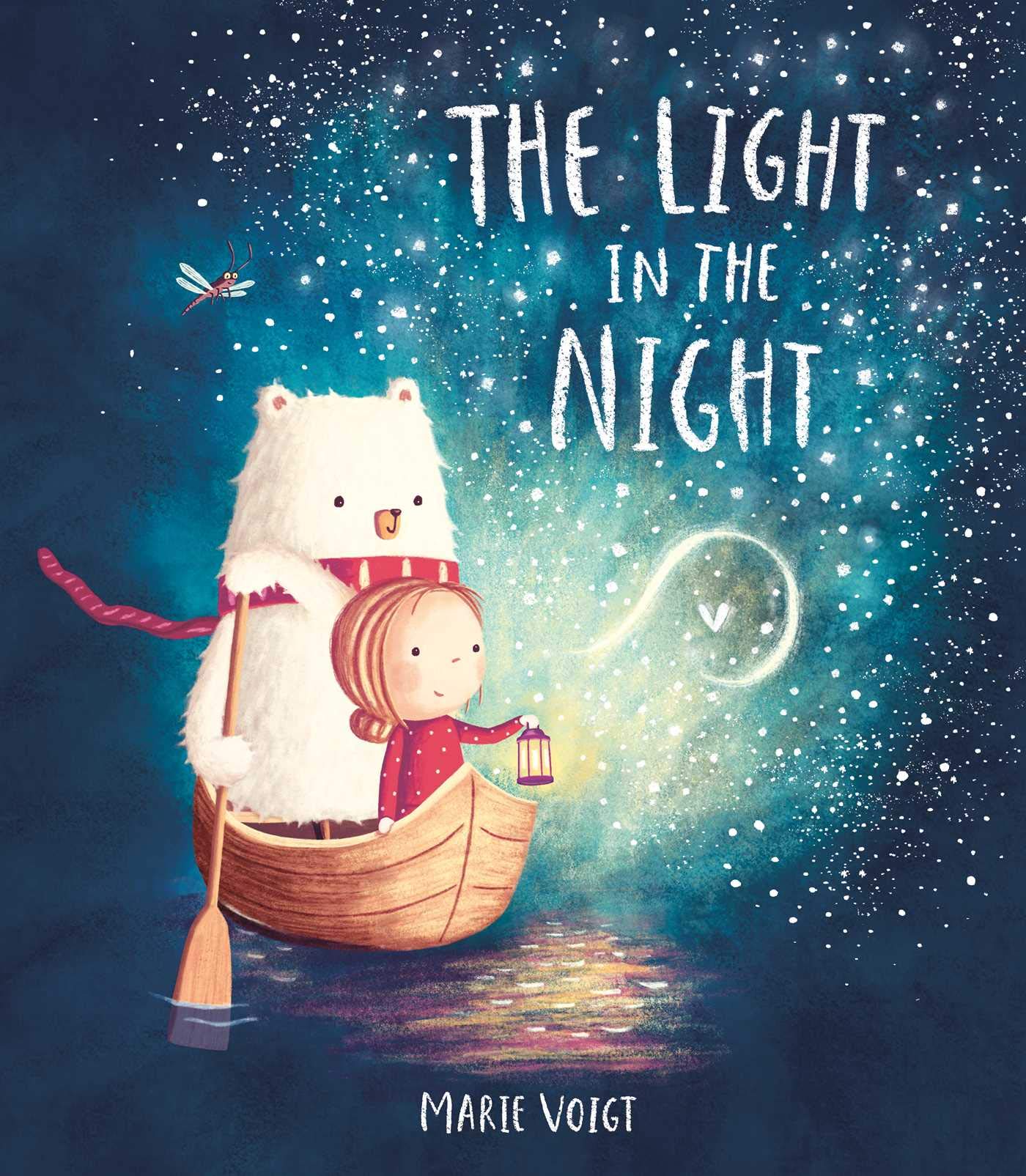
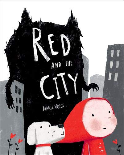
Marie’s debut picture book, Red and the City, was published by Oxford University Press in September 2018 . Her second picture book, The Light in the Night, was published by Simon & Schuster UK in February 2019. Here she explores the main themes in her stories, the use of colour and perspective in her work and the interplay between her artwork and words…

I wondered if we could start by talking about the main characters, Betty and Cosmo, from your new book The Light in the Night? Can you tell us a bit more about them and what inspired you to create them?
If it’s OK, I’ll answer this question the other way around, as this is kind of how this book was created too. Funnily enough, both characters started life quite a bit differently. Visually, Cosmo was actually inspired by another character I’d created for a completely different story once, which I didn’t take any further. And the character of Betty came from yet another story draft I’d once written in which a bear falls out of one of her books. So, in a way, my publisher and I decided to combine the best of the two stories into this one. Even though the premise of Cosmo, the bear, being scared of the dark and adventurous Betty helping him overcome his fear came as a completely new ingredient to the mix. This angle was inspired by yet more story drafts I’d written in the search for the strongest one.
The artwork in The Light in the Night has a very magical feel to it. Were there any artists or illustrators that particularly influenced your work in this story?
Thank you! To be honest, the artwork style in this book is probably closest to my natural style, and I didn’t really look for any ‘outside’ artwork inspiration before illustrating it. So to answer your question, I would probably have to look at a variety of artists whose work I’ve liked over the years and who thus may have had some influence on my style. The main ones are probably Oliver Jeffers, Rébecca Dautremer, David Litchfield, Jim Field and Benji Davies.
How is The Light in the Night similar to your other new book Red and the City? How is it different?
Great question. Like all your questions by the way! I may answer it the other way around again though… Even though Red and the City is based on a fairy tale and might appear much darker with its limited colour palette, one of its intended main messages of not succumbing to fear and letting your light shine is actually surprisingly similar to that of The Light in the Night! So, whilst it may not be immediately obvious, they are actually both intended as extremely positive and empowering books. The Light in the Night deals with this in a much more direct and bed-time-friendly way, whilst still offering some deeper meanings. Red and the City, on the other hand, may be more suitable for older children, schools and adults, so they can fully enjoy the absolute abundance of deeper messages hidden therein.
I loved this image from The Light in the Night! Can you talk a little further about this image – the layout, use of colour and perspective, the interplay between the artwork and the words?
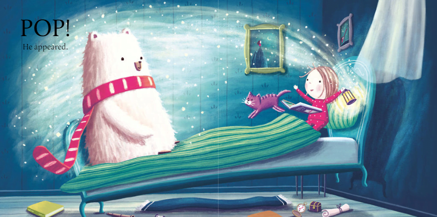
Thank you for appreciating this image, as it actually took me many iterations until I was finally happy with it. In the end, I decided on this ‘side-on’ layout with Cosmo on the left for an added element of surprise, so that, on first read, the child doesn’t glimpse him until the page is fully turned and the ‘POP! He appeared.’ text is read. The darker, tonal blues and greens help Cosmo literally pop off the page without being distracting, whilst some colour accents keep things interesting and further help the circular flow around the image, along with the sparkling light wave between Cosmo and Betty. I also started out with a view from above but felt this wasn’t as dynamic, immediate or engaging as this view from below, which also allowed me to show items sent flying, as well as items under Betty’s bed to further elaborate on her adventurous spirit.
I was interested to see that Red and the City uses a limited palette of colours – why is this? What impact do you think it has?
As I’ve always liked working in colours, this choice surprised even me. However, for some reason, it was just the way I saw the book in my mind. I think it works very well for it, as it really draws in on Red and the heart flowers who represent love, in direct contrast to a much darker and greyer system and adult world in which many have lost their true spirit. Also, I chose Woody to be white as a direct, more innocent contrast to the black wolf. Whilst this limited palette may not be my usual style, I found working in it extremely liberating, as it allowed me to really focus on the essence and symbolism of each scene, which probably made them more laden with meaning and stronger as a result.
In Red and the City, you present the city and modern-day life as being quite daunting, frightening and, at times, damaging. How do you feel the modern world affects children, both positively and negatively?
Even though we still have a long way to go, I suppose our world today is overall more tolerant and more encouraging of people pursuing their real passions and dreams instead of things that are expected or perceived to be the norm or ‘safe’ options. I believe the happier individuals are due to self-fulfilment, the more love they will spread and the happier the world will be as a whole. Another thing I like about our modern world is the internet, as it puts knowledge at our fingertips and anyone can learn anything that interests them, often completely for free.
However, I think in our world today it is also very easy to lose ourselves and never achieve our full potential. I believe as very young children, we all instinctively know how to be creative and express ourselves. However, as we grow up the system cleverly moulds us into roles and trains us to become perfect, sheep-like consumers. On top of that, many of our processed foods and drinks today make us hyperactive or lethargic and can cloud our minds. All the expectations and shocking news we get bombarded with instil fear and we end up looking for comfort in all the wrong things.
“I believe spending time in nature is of huge importance to reduce stress and reconnect with our true selves, but with the expansion of the modern world, many children are not afforded this opportunity regularly enough.”
I was particularly taken by this illustration in Red and the City – the sense of claustrophobia and disconnect. What sort of atmosphere and feeling did you want to create? How did you go about achieving this?
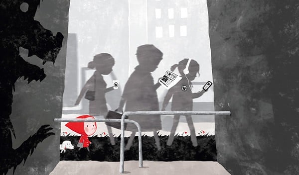
Whilst this image certainly creates this sense (mainly due to the converging walls that are pressing in on the rushing and distracted people), it was also intended to portray a challenge we are faced with. Parents often tell us to not stray from the path (‘get a good job’ etc etc), but actually this mainstream path of systematised workers and consumers (with wilting heart flowers) may not always be the best path for us (they are walking on wolf fur!). So here we have Red looking down for a way out of this conveyor-belt (because there certainly are ways if we are brave enough) which she later in the book takes. The wolf is delighted she’s entering the mainstream path and “getting his paw on her”. At the same time, he represents the fear we are often put under whenever we do consider leaving the mainstream path.
I’m interested in the relationship between your writing and your illustrating. Does the writing come first or the illustrations? How does one affect the other?
When I started out writing stories to hone my skills, the illustrations often came first. Now, I am trying more actively to write a really strong story first and not be as side-tracked by the kind of images that might pop up into my head and that I might like to paint. However, I don’t ignore them either, and often they still provide an initial spark for an idea. I feel blessed that I get to do both, as they do affect each other a lot, especially when it comes to fine-tuning the text and illustrations and the interplay between them to achieve the best overall effect.
How has technology changed the process of illustration for you?
This is definitely a huge advantage of the modern world. Whilst I wrote and painted a lot with traditional media as a child and teenager, I may not have taught myself to become a professional illustrator if it wasn’t for the advent of digital drawing solutions, and especially the iPad Pro with Procreate which I love even more than Photoshop! They allowed me to fall in love with drawing and painting all over, but this time not just drawing from real-life but actually learning how to draw anything from my imagination as digital media makes it easier to experiment and correct things. Being mainly self-taught and a perfectionist, I just love the flexibility of digital media. Being able to fairly quickly try the effect of different compositions, colours, lighting and expressions is priceless and so much fun.
What advice would you give to teachers about how to develop reading for pleasure in their classrooms and schools?
OK, in no particular order, here are some random, rambling thoughts: Make it fun and relevant. Draw them into a book by maybe first having a fun chat about a related topic, or looking at the title and the cover and discussing what the book may be about. Where possible, let them choose what they want to read. Any reading counts. If it’s a reluctant older reader who prefers to read picture books, joke books or Guinness World Records then encourage them in that by showing an interest and maybe asking them to talk about it to the class. Talk about how what they are reading relates to their life. Maybe sometimes go out and do an activity that relates to something they’ve read and compare the real-world experience to what they’ve read. Inspire them to write themselves. Maybe sometimes show just the images of a picture book and let the students tell their own story and then compare their version with the author’s version and chat about the merits of both. Maybe have students read fun theatre plays for kids out loud in roles and act them out. Maybe show a scene from a Harry Potter movie and then read the corresponding scene from the book (or, possibly better still, the other way around) to demonstrate the extra info and enjoyment they get from reading the book versus just watching the movie. Be seen reading yourself and talk to your class about the book you’re reading. I also like teachers who put notices up on their door, saying “Currently reading XYZ”. I also like themed classroom walls and hallways that display books, posters and standees of books to get students interested. Maybe encourage students to start a book club. Maybe have a little literature festival with author Skype chats (many are happy to provide these for free). Even if you don’t have a full-on school library, you can probably still start a little library bookshelf or a book swap / donation station.
What advice would you give to any budding young illustrators?
I believe anyone with a passion for illustrating, focus and hard work can become a professional illustrator for not a lot of money these days, thanks to YouTube tutorials and excellent resources like the Society of Visual Storytelling (www.svslearn.com). Also, share your work on social media. If you can, go to Bologna or Frankfurt Book Fair or illustrator conferences. Don’t be afraid to network, show your work, stand out and approach agents and publishers directly (even outside of their portfolio sessions). Send your best work to agents (if you want one) and art directors. The more personalised and professional your enquiry the better. But even striking postcard campaigns do work! Try to get feedback, take it on board and keep getting better. Have a clear goal of what you’re trying to achieve and go after it. Self-belief, focus, persistence, hard work and professionalism are more important than perceived ‘natural’ talent.
Can you tell us a little bit about what you’re working on next?
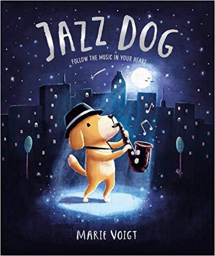
I’ve already finished my third book, Jazz Dog, which is my second book with Oxford University Press after Red and the City, and publishing in the UK this September. It’s a story about a little dog going against the stream in a divided world of cats and dogs, doing what feels right to him, even though everyone is laughing at him, and ultimately bringing cats and dogs closer together as a result.
I am now excited to be working on my fourth book, which is my second one with Simon & Schuster after The Light in the Night, but it’s still too early to share specifics.
Finally, can you describe The Light in the Night in three words?
Heart-warming, empowering, magical.